Case Study: Chicago 311 Graffiti Data#
Note
Source: Adapted from scalaworkshop by George K. Thiruvathukal and Konstantin Läufer. Original Scala implementation at introds-scala-examples/311-case-study-scala. Data published by the City of Chicago under the Chicago Data Portal open data licence.
Problem. The City of Chicago publishes every graffiti-removal request submitted through its 311 system as open data. Can we download that dataset, explore its structure, and find patterns — which ZIP codes generate the most requests? How does volume change by season?
This case study builds a complete data pipeline in Python using
pandas for data loading and analysis, and matplotlib for
visualisation:
Fetch → Load → Aggregate → Filter → Visualize
The dataset URL is:
https://data.cityofchicago.org/api/views/hec5-y4x5/rows.csv?accessType=DOWNLOAD
Step 1 — Fetch#
urllib.request.urlretrieve streams the file directly to disk
without loading the entire response into memory — important for a
dataset that can exceed 100 MB:
def fetch_graffiti(output: str = "311_graffiti.csv") -> None:
    """Download the 311 Graffiti Removal dataset from the Chicago Data Portal."""
    print(f"Downloading to {output} ...")
    urllib.request.urlretrieve(DATASET_URL, output)
    print("Done.")
fetch_graffiti("311_graffiti.csv")
Output:
Downloading to 311_graffiti.csv ...
Done.
Step 2 — Load and Inspect#
pd.read_csv reads the file into a DataFrame in one call. The
optional nrows parameter limits how many rows are read, which is
useful for previewing a large file without loading all of it into
memory. We immediately parse the Creation Date column as proper
datetime objects so that filtering and grouping by date work
naturally later:
def load_graffiti(filename: str, limit: int | None = None) -> pd.DataFrame:
    """Load the dataset into a DataFrame; parse Creation Date as datetime."""
    df = pd.read_csv(filename, nrows=limit)
    df["Creation Date"] = pd.to_datetime(
        df["Creation Date"], format="%m/%d/%Y", errors="coerce"
    )
    return df
df = load_graffiti("311_graffiti.csv", limit=3)
print(df[["Creation Date", "Status", "ZIP Code"]].to_string(index=False))
Output (representative):
Creation Date     Status ZIP Code
   2024-01-02  Completed    60614
   2024-01-02  Completed    60647
   2024-01-03       Open    60618
The dataset includes columns for creation and completion dates, street address, ZIP code, latitude/longitude, ward, and police district.
Step 3 — Aggregate#
Series.value_counts() counts how many rows contain each distinct
value in a column and returns a Series sorted from most to least
frequent. Chaining .head(top) limits the result to the top N
entries:
def aggregate_graffiti(filename: str, group_by: str = "ZIP Code",
                        top: int = 10) -> pd.Series:
    """Return the top-N value counts for the given column."""
    df = load_graffiti(filename)
    return df[group_by].value_counts().head(top)
for zip_code, count in aggregate_graffiti("311_graffiti.csv", top=5).items():
    print(f"{zip_code:10s}  {count:6,}")
Output (representative):
60614       4,821
60647       4,203
60618       3,977
60622       3,840
60625       3,512
Step 4 — Filter#
Real datasets need filtering before analysis. Because load_graffiti
already parsed Creation Date as datetime, we can compare it directly
against date strings using pandas boolean indexing. The & operator
combines conditions row-wise; wrapping each condition in parentheses is
required because of Python’s operator precedence:
def filter_graffiti(filename: str, status: str = "Completed",
                     start: str = "2015-01-01",
                     end: str = "2015-12-31") -> pd.DataFrame:
    """Return rows whose Status matches and Creation Date falls in [start, end]."""
    df = load_graffiti(filename)
    mask = (
        (df["Status"] == status) &
        (df["Creation Date"] >= start) &
        (df["Creation Date"] <= end)
    )
    return df[mask]
The result is a new DataFrame containing only the matching rows — no
manual date parsing or try/except loops needed.
matches = filter_graffiti("311_graffiti.csv",
                           status="Completed",
                           start="2015-01-01",
                           end="2015-01-31")
print(f"{len(matches):,} completed requests in January 2015")
Output:
9,480 completed requests in January 2015
Step 5 — Visualize#
Grouping by year-month and plotting a bar chart reveals the seasonal pattern in graffiti removal activity. Requests dip in winter (cold weather means fewer outdoor surfaces are tagged) and peak in late spring and summer:
def visualize_graffiti(filename: str,
                        output: str = "graffiti_trend.png",
                        year_start: int | None = None,
                        year_end: int | None = None) -> None:
    """Save a bar chart of monthly graffiti request counts."""
    df = load_graffiti(filename).dropna(subset=["Creation Date"])
    if year_start is not None:
        df = df[df["Creation Date"].dt.year >= year_start]
    if year_end is not None:
        df = df[df["Creation Date"].dt.year <= year_end]

    monthly = df.groupby(df["Creation Date"].dt.to_period("M")).size()
    months = [str(m) for m in monthly.index]
    counts = monthly.to_list()

    fig, ax = plt.subplots(figsize=(12, 5))
    ax.bar(months, counts, color='steelblue')
    ax.set_title("311 Graffiti Removal Requests Per Month")
    ax.set_xlabel("Month")
    ax.set_ylabel("Requests")
    plt.xticks(rotation=45, ha='right')
    plt.tight_layout()
    plt.savefig(output, dpi=100)
    plt.close()
    print(f"Saved {output}")
Note
The Chicago 311 graffiti dataset on the Data Portal covers 2011–2018. The portal stopped updating this particular view after that period; more recent 311 data is published under a different endpoint. When working with open datasets, always check the date range before drawing conclusions.
visualize_graffiti("311_graffiti.csv", "graffiti_trend.png",
                   year_start=2015, year_end=2018)
Output:
Saved graffiti_trend.png
Install matplotlib first if needed:
pip install matplotlib
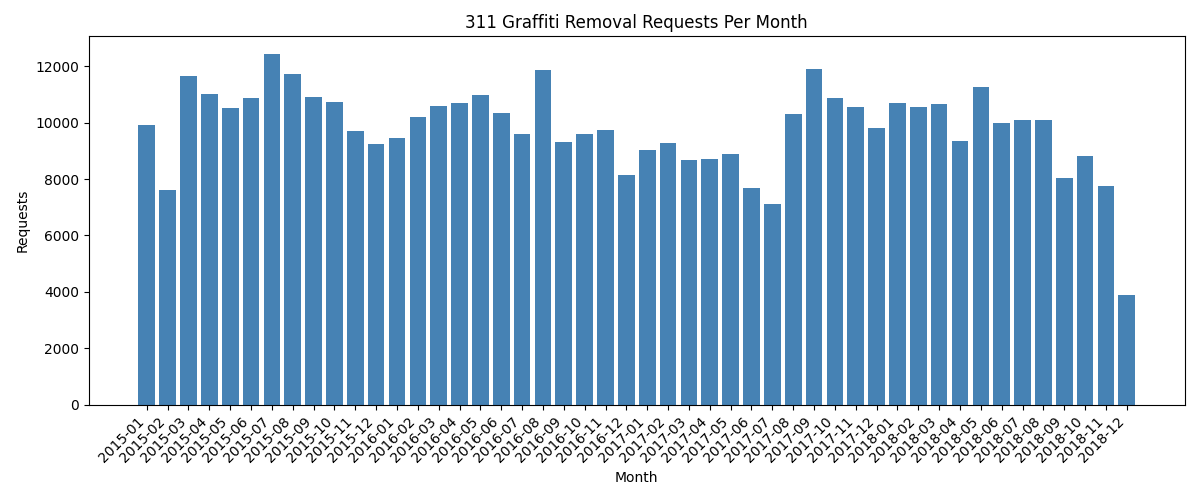
Monthly graffiti removal requests from the Chicago 311 open dataset (2015–2018).#
To see the full span of the dataset at a glance, plot annual totals across all years:
def visualize_by_year(filename: str,
                       output: str = "graffiti_by_year.png",
                       min_year: int = 2010) -> None:
    """Save a bar chart of total graffiti removal requests per year."""
    df = load_graffiti(filename).dropna(subset=["Creation Date"])
    df = df[df["Creation Date"].dt.year >= min_year]

    yearly = df.groupby(df["Creation Date"].dt.year).size()
    years = list(yearly.index)
    counts = list(yearly.values)

    fig, ax = plt.subplots(figsize=(10, 5))
    ax.bar(years, counts, color='steelblue', width=0.6)
    ax.set_title("311 Graffiti Removal Requests Per Year")
    ax.set_xlabel("Year")
    ax.set_ylabel("Requests")
    ax.set_xticks(years)
    ax.yaxis.set_major_formatter(
        plt.FuncFormatter(lambda x, _: f"{int(x):,}")
    )
    plt.tight_layout()
    plt.savefig(output, dpi=100)
    plt.close()
    print(f"Saved {output}")
visualize_by_year("311_graffiti.csv", "graffiti_by_year.png")
Output:
Saved graffiti_by_year.png
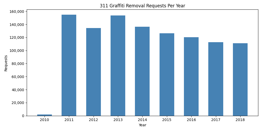
Total graffiti removal requests per year (2010–2018). The 2010 bar is partial (data begins mid-year); 2011–2018 show full annual volumes.#
What the Data Reveals#
311 reports are not merely complaints — they are a form of civic participation. Analysing this data over time and across ZIP codes surfaces questions about equity: are removal requests serviced equally across neighbourhoods? Are response times consistent? Which wards have the highest volume, and why?
This dataset is a starting point. The same pipeline — fetch, load, aggregate, filter, visualise — applies to any of the hundreds of other datasets published on the Chicago Data Portal.
Challenges#
Call
aggregate_graffitiwithgroup_by="Ward"instead of"ZIP Code". Which ward has the most graffiti removal requests?Write a function
average_completion_days(filename)that loads the DataFrame, parses both"Creation Date"and"Completion Date"as datetime, and returns the mean ofdf["Completion Date"] - df["Creation Date"](in days) for completed requests. Usepd.to_datetime(..., errors="coerce")to handle missing values — they becomeNaTand are excluded automatically by.mean().The dataset includes
"Latitude"and"Longitude"columns. Write a function that filters the DataFrame to rows within a bounding box (min/max lat/lon) using boolean indexing, and returns the count. Use it to count requests in a neighbourhood of your choice.Extend
visualize_graffitito overlay a 12-month rolling average line on top of the monthly bars. After computingmonthly, usepd.Series(counts).rolling(12, min_periods=1).mean()to generate the smoothed values.Download the 311 Pothole Reports dataset (view ID
7as2-ds3y) and compare monthly volumes for graffiti and potholes side-by-side on a single chart using two sets of bars.